
Old photographs have a distinct charm. Their muted tones, soft contrasts, subtle blur, and grainy textures evoke a sense of nostalgia. In this Photoshop tutorial, you’ll discover how to craft that retro look entirely by hand — no prebuilt filters, no external plug-ins. Just layered adjustments and a little creative patience. 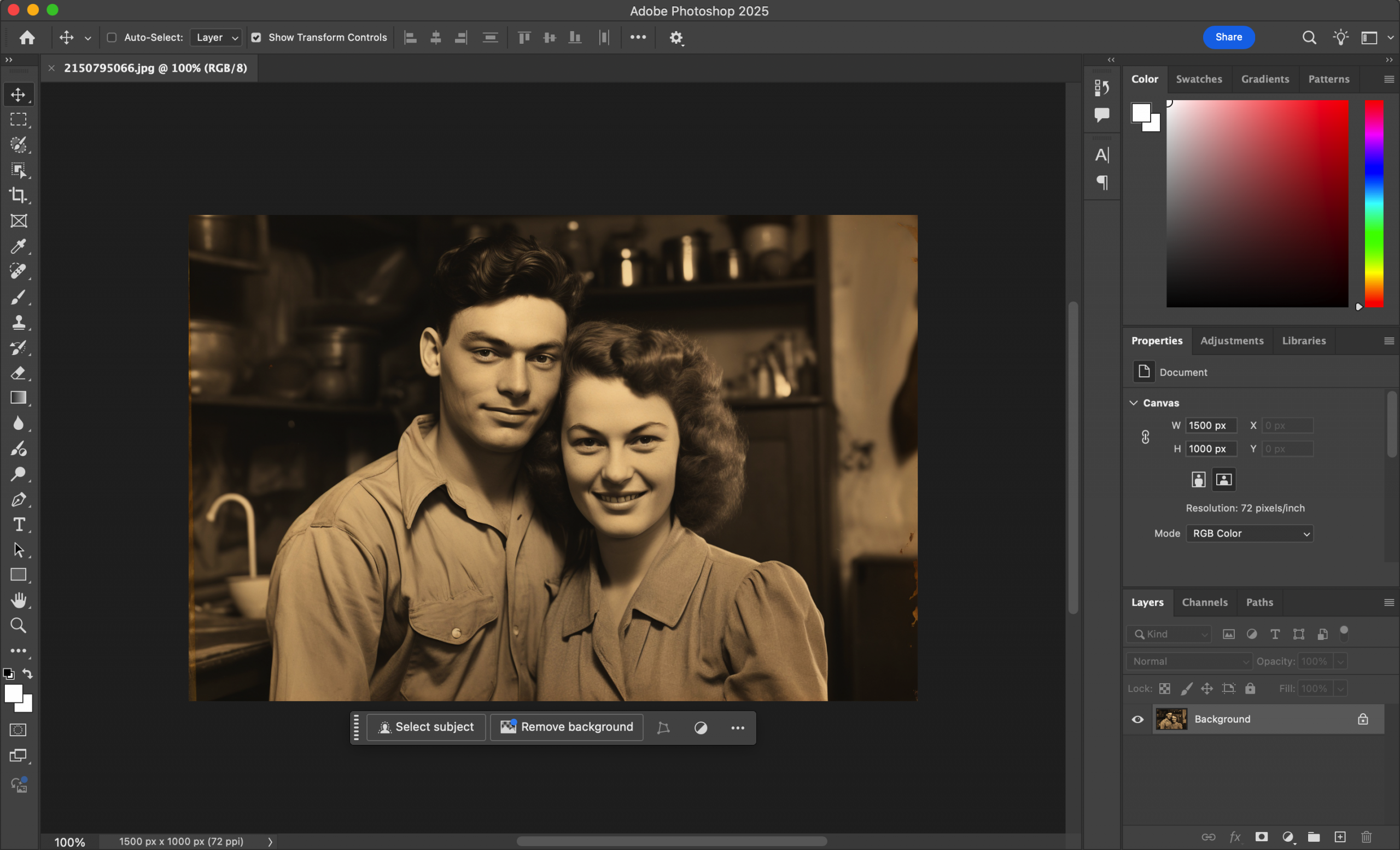
We’ll walk through how to tone your image, add analog-style grain, blur your edges subtly, and apply color grading that mimics aged film. Whether you’re editing portraits, urban scenes, or still-life shots, this guide offers a replicable path to a timeless visual aesthetic.
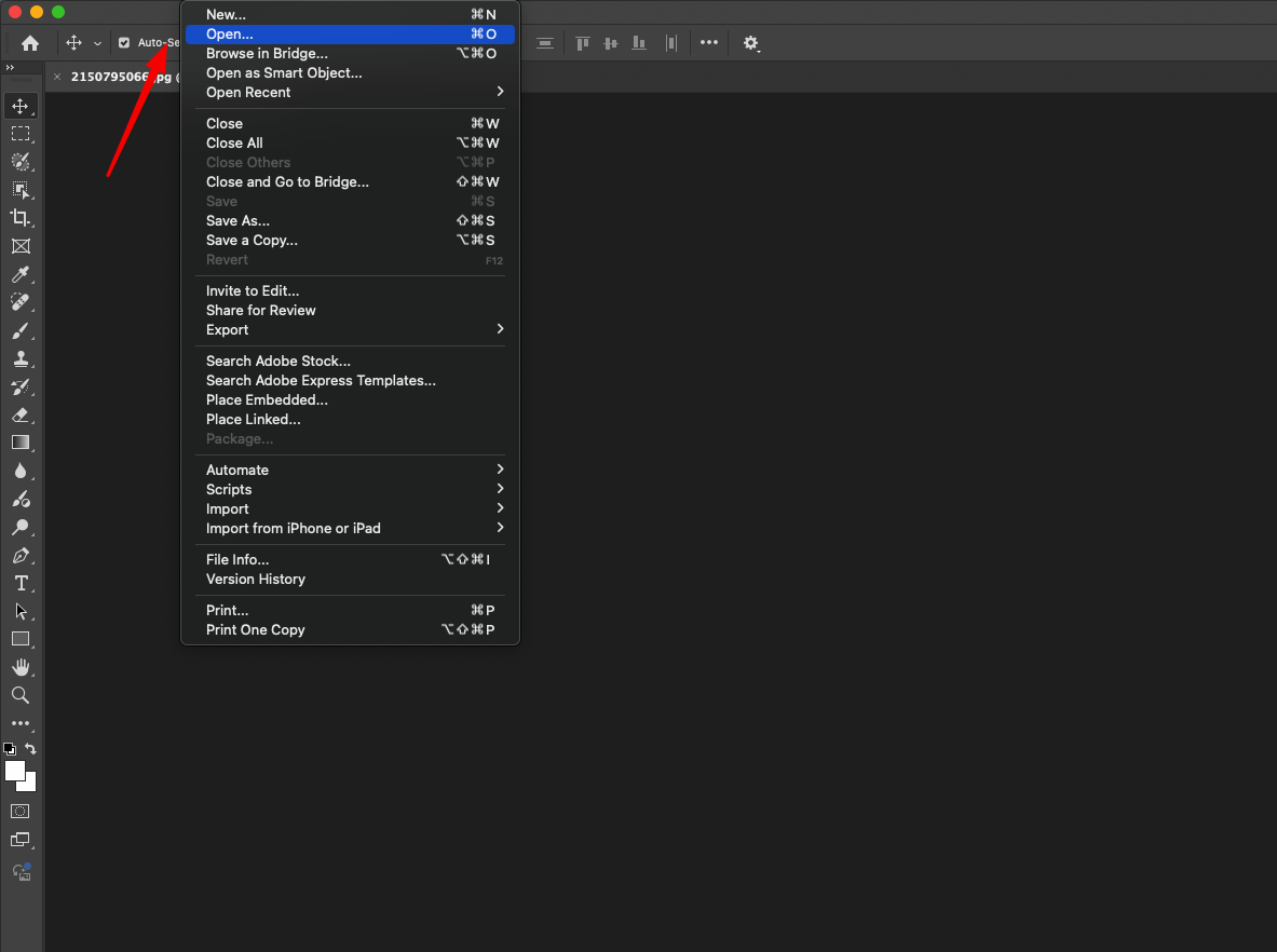
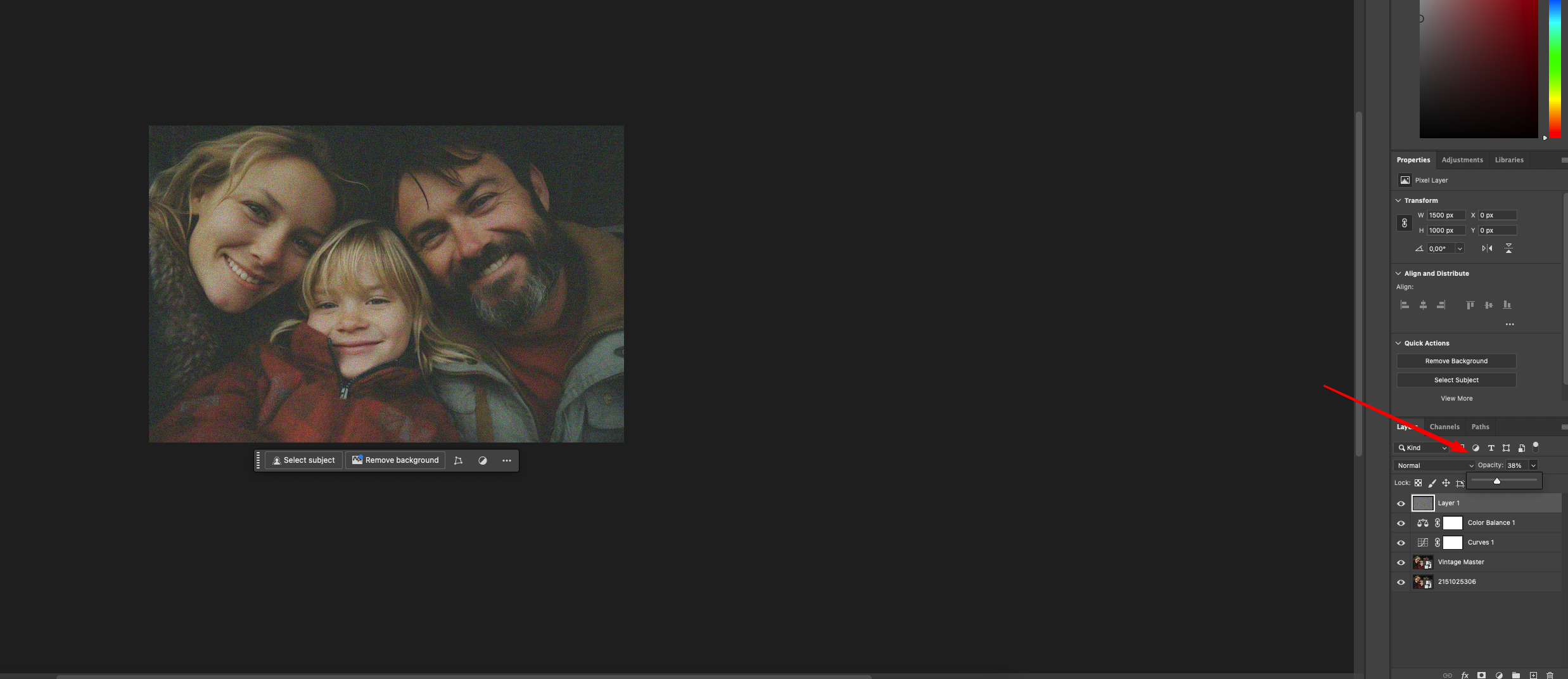
Step 1: Start with a High-Quality Image and Duplicate the Layer
Open a well-lit, detailed image in Photoshop. Natural light and neutral tones tend to work best. Then:
- Navigate to File > Open and select your chosen photo.
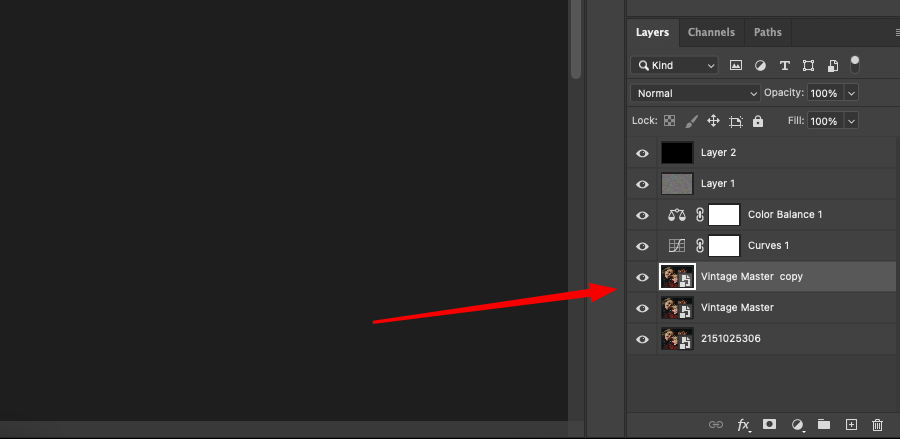
- In the Layers panel, right-click on the base Background layer and choose Duplicate Layer. Rename the copy to Vintage Master or something similar.
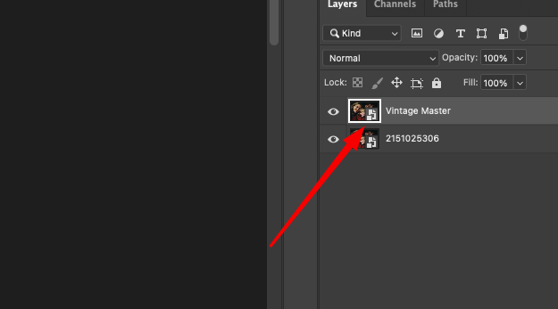
Keeping your original untouched ensures you can revert or blend selectively later.
Step 2: Use Curves to Create a Faded Film Feel
The vintage look often starts with faded contrast. Here’s how to achieve it using Curves:
- Create a new Curves adjustment layer.
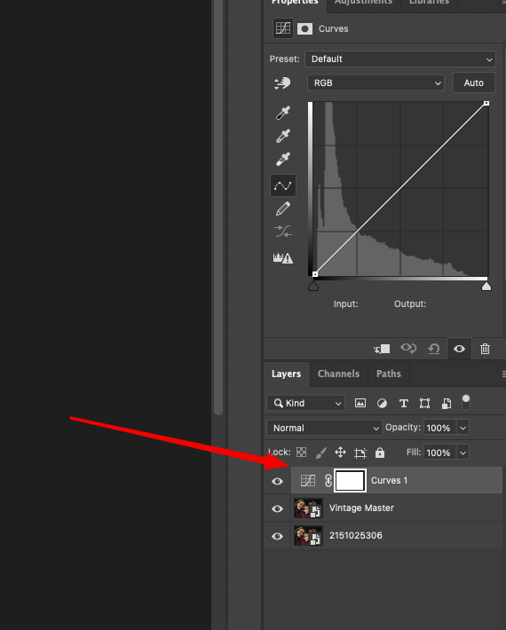
- In the RGB composite channel, lift the black point slightly upwards — this flattens your shadows.
- Pull the white point just a touch downward to mute highlights.
- Add a subtle S-curve to maintain midtone depth without harshness.
This alone will instantly age your image, softening its dynamic range.
Step 3: Adjust the Mood with Targeted Color Shifts
Old photographs usually lean warm — with creamy yellows in the highlights and a hint of blue in the shadows. To replicate that manually: 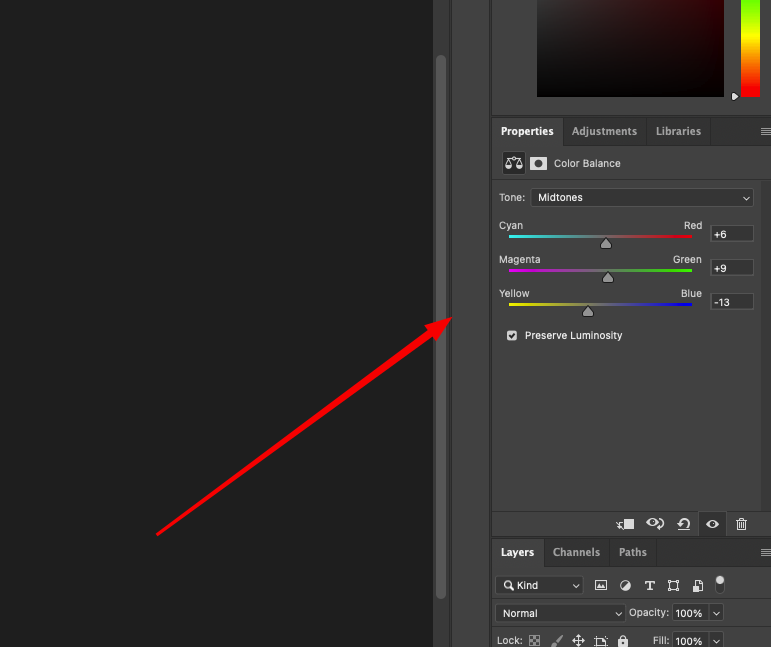
- Add a Color Balance adjustment layer.
- In the Midtones, nudge sliders toward Red and Yellow.
- Switch to Shadows and dial in a small shift toward Cyan and Blue.
- In Highlights, add a gentle touch of Yellow again.
This split-toning technique helps separate your color zones subtly and believably.
Step 4: Introduce Grain for Texture 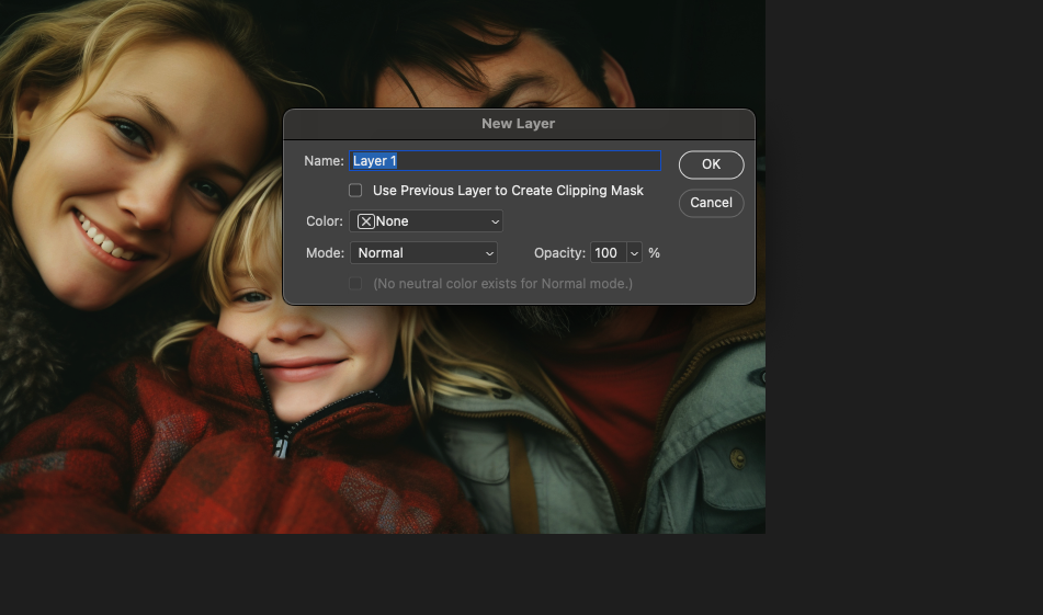
Film grain adds character. Here’s how to simulate it manually:
- Make a new blank layer and fill it with 50% gray (Edit > Fill > 50% Gray).
- Apply Filter > Noise > Add Noise with around 10% strength, set to Gaussian and Monochromatic.
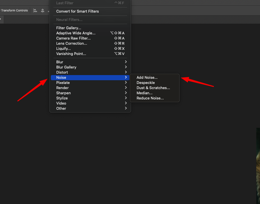
- Change the blend mode of this layer to Overlay.
- Adjust the opacity down to around 30–40% for realism.
You now have a controlled grain layer that mimics analog imperfections.
Step 5: Add a Vignette for Depth
To draw attention to the center and add age:
- Create a new black-filled layer.
- Go to Filter > Lens Correction, then switch to the Custom tab.
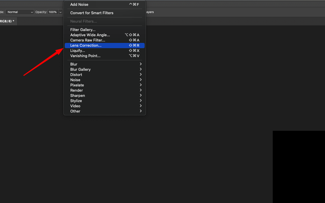
- In the Vignette section, reduce the Amount to -60 (or to taste) and adjust Midpoint as needed.
- Optionally reduce this layer’s opacity or mask areas selectively.
This softens your image’s edges and focuses the viewer’s eye.
Step 6: Apply Selective Edge Blur
Vintage lenses weren’t razor sharp. To recreate that look:
- Duplicate your Vintage Master layer.
- Apply Filter > Blur > Gaussian Blur with a radius of 2–4 px.
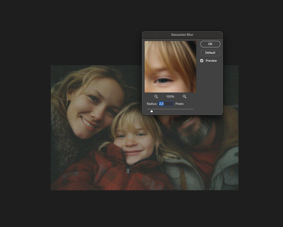
- Add a black-filled mask to this blurred layer.
- Use a soft white brush to paint blur onto the outer edges only.
This gives a natural drop-off in sharpness, just like older lenses produced.
Step 7: Add Warm Overlay for Atmosphere (Optional)
To further enrich the tone:
- Create a Solid Color Fill layer — pick a warm hue like amber or dusty orange.
- Change the blend mode to Soft Light.
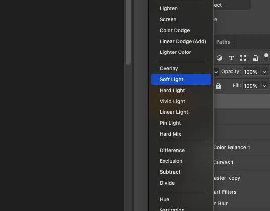
- Drop the opacity to around 15%.
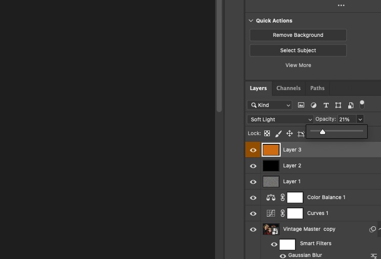
This washes your image with a glow that enhances the vintage mood.
Step 8: Final Polish and Custom Tweaks 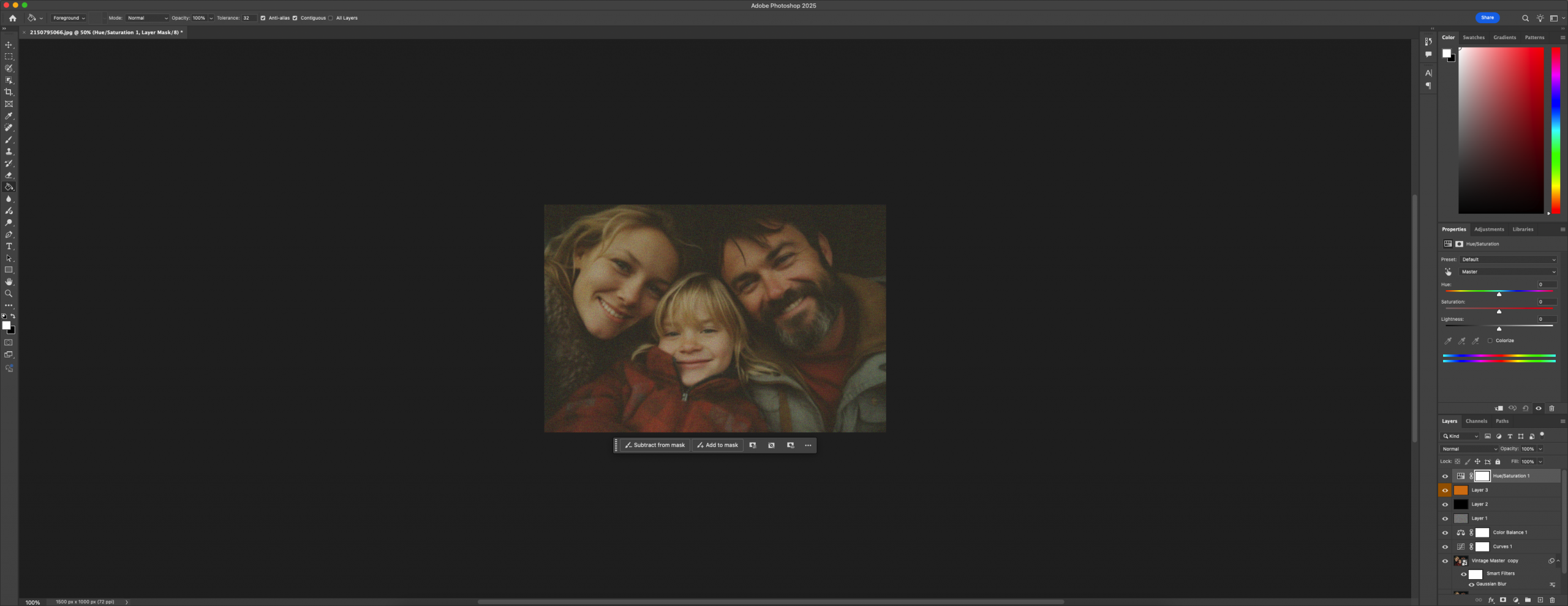
The base effect is complete, but it’s worth refining:
- Use a Hue/Saturation layer to reduce overall vibrancy by 10–15%.
- Adjust Color Balance in shadows or highlights if the tones feel too biased.
- Crop to older aspect ratios (like 5:4 or square) to match vintage framing.
Once you’re satisfied, save your setup as an Action if you plan to reuse it.
Optional Uses and Adaptations
Vintage effects aren’t limited to personal projects. You’ll see this style everywhere from music covers to indie fashion brands. Try using it for:
- Moody portraits with storytelling character
- Nature shots with a timeless finish
- Event posters with retro flair
- Marketing visuals that need warmth and texture
Want something colder and more desaturated? Shift your tones toward teal and mute the saturation even more. Want a stronger film look? Add scratches or light leaks using textures.
What Else Can You Do With This Look?
Once you’ve mastered this vintage effect, try bending the rules a little. Use it not only on portraits, but also on urban photos, product images, or anything with texture and mood. The retro vibe isn’t just for people — it adds depth to empty rooms, makes signs look aged, or even gives food photography a film-style glow. Play around.
Say you’re editing for a craft coffee shop’s social media. A shot of a barista mid-pour, tinted warm and framed with soft blur, suddenly feels like a memory, not just content. That’s powerful. Or imagine applying this to scanned childhood photos — they already have age, but enhancing them this way adds intentional nostalgia.
Final Reflections
The appeal of vintage styling comes from its imperfections — the lifted shadows, the soft corners, the toned-down color palette. When recreated thoughtfully, these elements give your digital image the weight and emotional pull of a real printed photo pulled from an old box.
Building this effect manually instead of relying on filters gives you full control. You know exactly what’s happening at each step, which means you can tweak, refine, or go off-script when needed. The result: imagery that feels handcrafted, deliberate, and full of subtle atmosphere.
You don’t need presets to be expressive. You need patience, taste, and a good eye. This tutorial gives you the tools — the rest is in your hands.


