
PowerPoint is often seen as a basic slide tool, but when used properly, it can deliver sleek, professional results that really leave an impression. In this tutorial, I’ll walk you through the steps of building a stylish, effective presentation — from blank slide to polished showpiece. This guide is ideal for beginners but rich enough in detail to help anyone polish their PowerPoint skills.
Read also: How to create an animation to a PowerPoint presentation
Step 1: Start with a Clean, Blank Slide
When you open PowerPoint, you’re greeted with a default slide that includes a title box and a subtitle box. It’s tempting to use this as your first slide, but I recommend removing all placeholder content. Just right-click on the text boxes and delete them. This gives you complete control over layout and design from the start.
Now go to the “View”  tab and activate “Slide Master.” This lets you design a consistent look across all your slides. Choose a simple, neutral background — white or light gray works well. Avoid busy patterns or gradients unless you’re confident in your design sense.
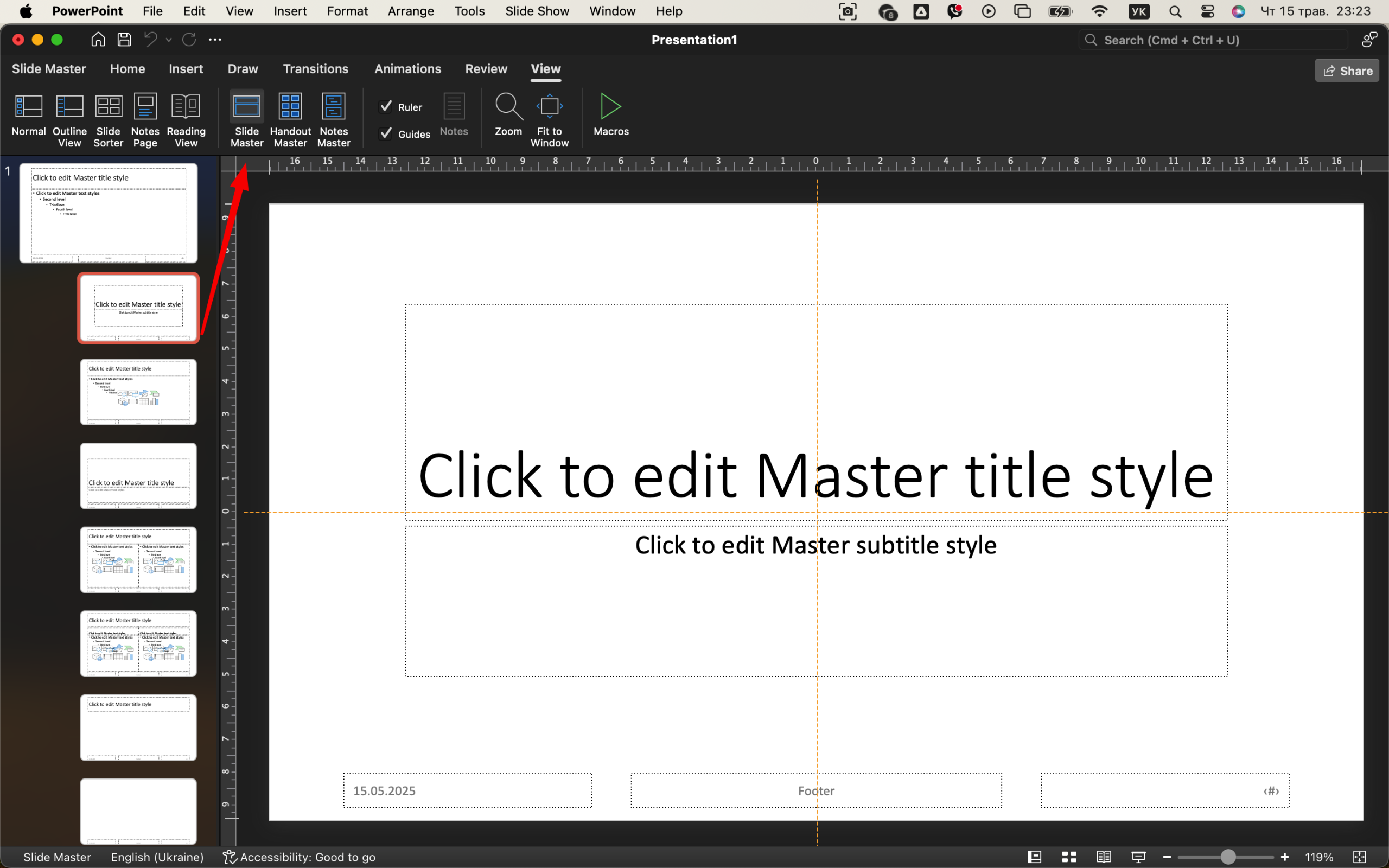
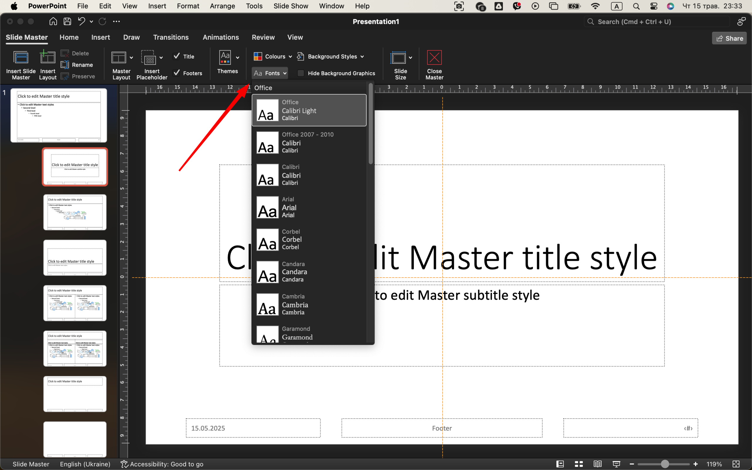
Step 2: Choose a Cohesive Font Pairing
Fonts can make or break the visual appeal of your presentation. Stick with two fonts — one for headings, one for body text. A great combination is Montserrat for headings and Open Sans for body. Both are clean, modern, and easy to read. If you don’t have them, install them for free from Google Fonts. 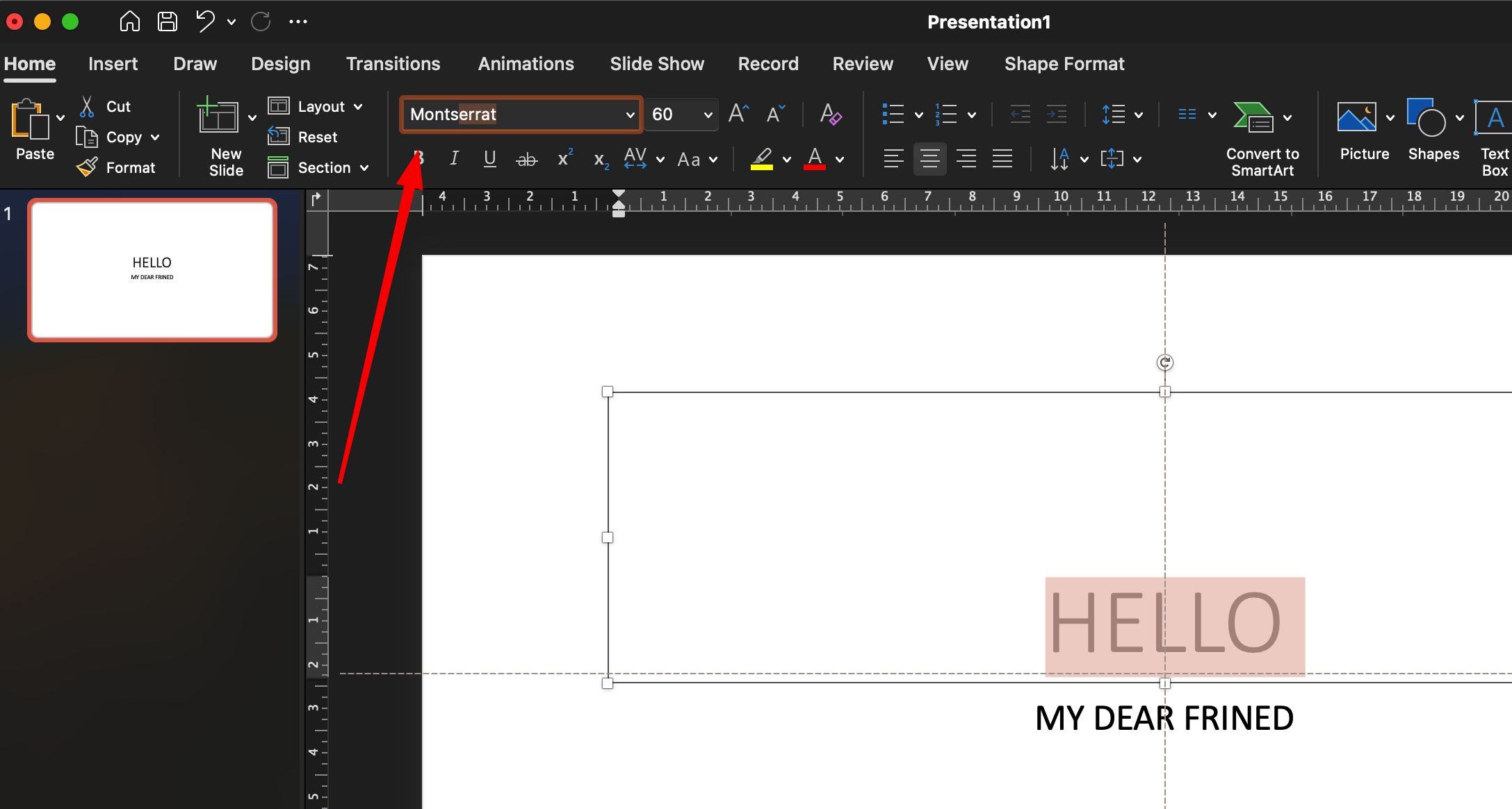
To apply your fonts, go to “Slide Master” view, highlight the text areas, and change the font from the Home tab. This ensures consistency across all slides. Use larger sizes for headings (28–36 pt), and body text should be between 16–20 pt depending on slide size and layout.
Step 3: Build a Color Palette That Works
PowerPoint gives you preset color themes, but they’re often outdated. Instead, make your own. Choose 3–4 colors:
- A dark neutral (e.g., navy, dark gray) for text
- A bold accent (e.g., royal blue, crimson) for headers or key visuals
- A softer contrast (e.g., light blue, beige) for backgrounds or boxes
- An optional fourth color for variation
You can define these under “Design” → “Variants” → “Colors” → “Customize Colors.” Give your color theme a name so you can reuse it later. 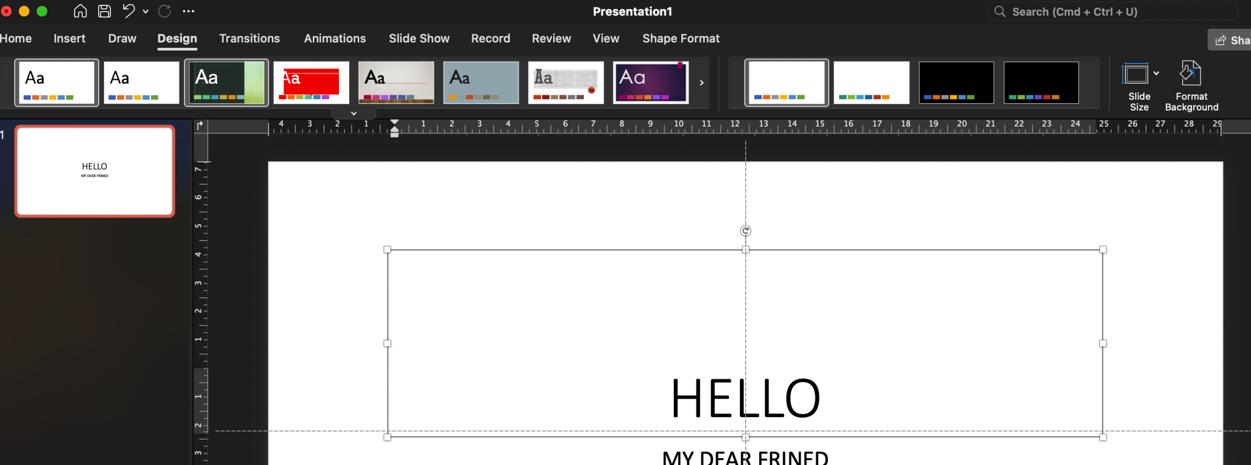
Step 4: Add Visual Hierarchy and Spacing
Don’t cram content into one slide. Use white space effectively to guide the viewer’s eye. Break information into digestible chunks. Each slide should focus on one idea or topic.
Use headings, subheadings, and bullet points. Avoid large paragraphs — PowerPoint isn’t a novel. If something takes more than 2–3 short lines to explain, consider simplifying the message or moving the content to a new slide.
Use the “Align” and “Distribute” tools under the “Format” tab to keep objects evenly spaced. You can also use PowerPoint’s built-in gridlines to position items more precisely. 
Step 5: Add Icons and Images That Support Your Message
PowerPoint now includes built-in icons and illustrations under “Insert” → “Icons.” These are scalable vector graphics, meaning they won’t get pixelated. Use them to replace long descriptions or to reinforce your points visually.
When using photos, ensure they’re high-resolution and aligned to your topic. Avoid cheesy stock images — instead, look for modern, flat-style images or use free photo libraries like Unsplash or Pexels. Add images via “Insert” → “Pictures” → “This Device” or “Online Pictures.” 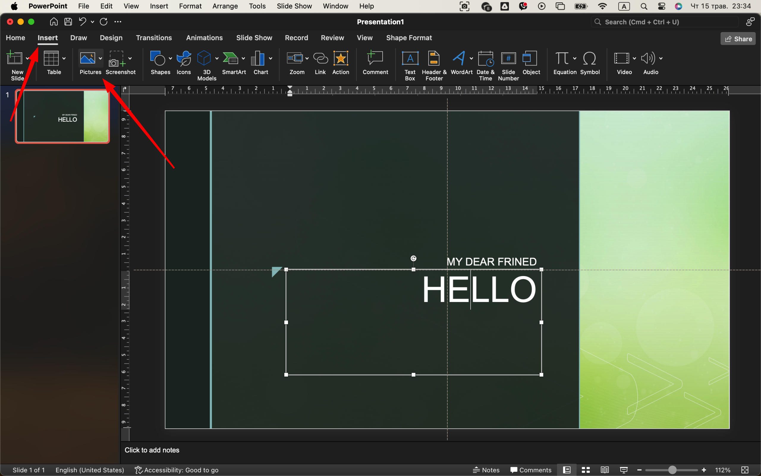
To maintain a consistent feel, apply subtle filters or adjust transparency and color overlays so images blend into the background rather than dominate it.
Step 6: Use Smart Transitions and Animations
Animations should be subtle. Use “Fade” or “Wipe” rather than flashy effects like “Bounce” or “Zoom.” Select your object, click “Animations,” and choose a simple entry. Avoid having every word fly in — this distracts from the message. 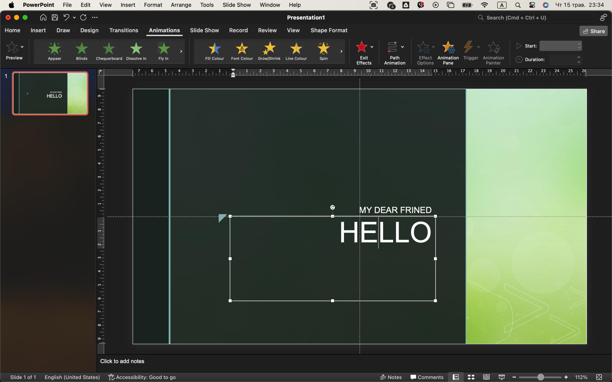
For slide transitions, use the “Morph” transition for smooth movement between slides (available in newer versions of PowerPoint). Otherwise, “Fade” is a safe, professional option.
Animations should serve a purpose: highlighting progression, building lists step by step, or guiding attention to a point. Don’t animate just for fun.
Step 7: Insert Charts and Data Wisely
PowerPoint lets you insert pie charts, bar graphs, and more directly via the “Insert” → “Chart” menu. But that doesn’t mean you always should. Ask: does this data need a chart? Can it be summarized in one sentence?
If you do use charts:
- Remove background lines
- Make fonts readable (16pt minimum)
- Label data clearly
- Stick to your color theme
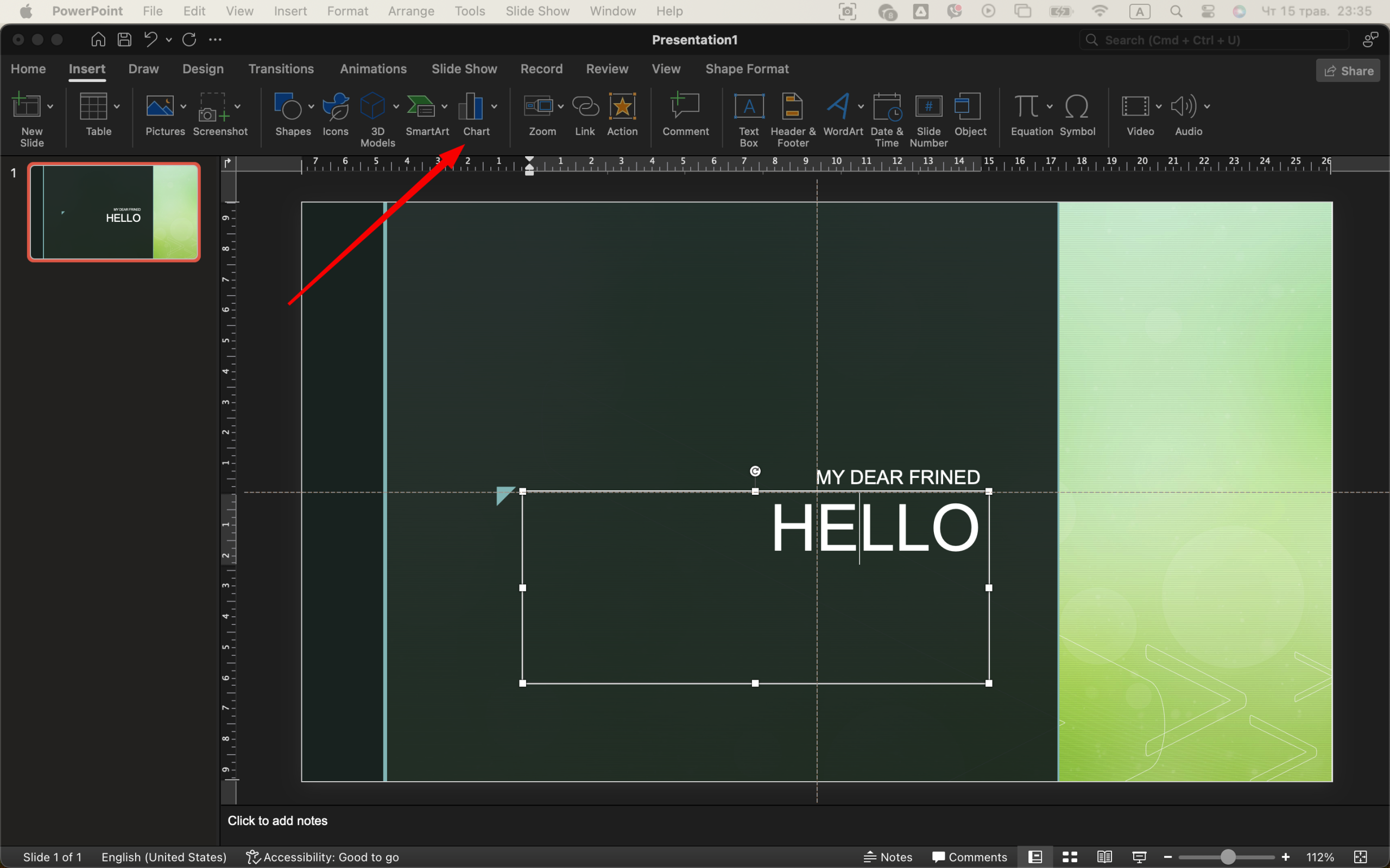
Avoid 3D charts — they look dated and are harder to read. Flat, minimalist data visualizations are best.
Step 8: Add Slide Numbers, Branding, and Footers
In “Insert” → “Header & Footer,” you can add slide numbers and a small footer with your name or brand. This gives your slides a professional polish. Keep footer text minimal — a logo, short domain name, or year is enough.
For consistency, go back to “Slide Master” and insert these elements there so they appear on every slide. 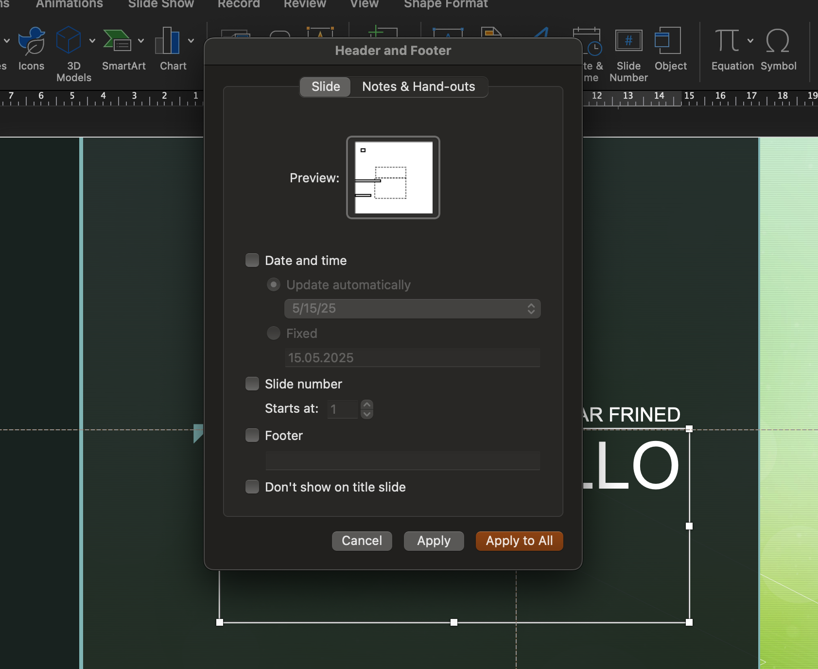
Step 9: Rehearse and Polish the Final Slides
Once your content is in, go through your slides in presentation mode. Look for:
- Inconsistent fonts or colors
- Misaligned elements
- Too much or too little white space
- Slides that feel too busy
Edit ruthlessly. Every slide should earn its place. Trim where needed. Clean up your animations. Practice delivering the presentation out loud to check timing and flow.
Step 10: Export and Share Like a Pro 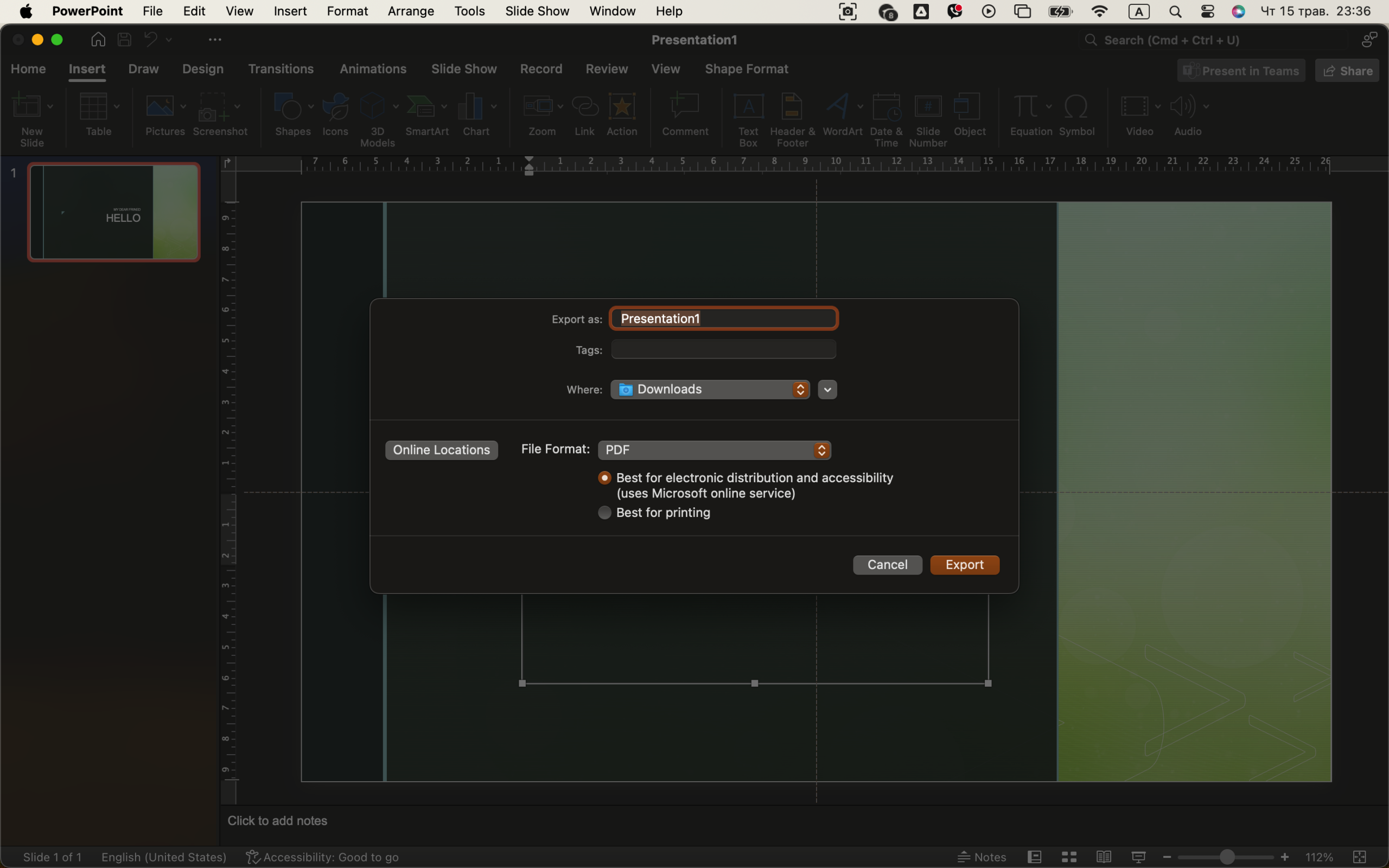
When finished, export your presentation in the format you need:
- For sharing: File → Export → PDF
- For presenting: Save as .PPTX or upload to OneDrive
- For video: File → Export → Create a Video (great for automated delivery)
If you’re sending it via email, compress images to reduce file size: File → Info → Compress Media.
Final Thoughts
PowerPoint may seem simple on the surface, but with thoughtful design, it becomes a powerful communication tool. The key is consistency, restraint, and clarity. Stick to strong fonts, clean layouts, and useful visuals. When every slide feels intentional — not cluttered — your audience stays engaged, and your message comes through clearly.
With just a bit of practice, you’ll find yourself not just making slides — but crafting experiences.


