
Microsoft Office Power Point is a powerful software for working with presentations and visual content. It has various tools for easy and intuitive display of data. These include graphs and charts. They open up advanced features and customizations for users.
Features of graphs and charts in Power Point
A chart refers to the visual display of data for better perception of the viewer. With their help, it is convenient to display trends and trends, for example, upward or upward. Diagrams are also used to compare the properties of processes, phenomena and objects on a number of points. In practice, this makes it possible to understand the dynamics without diving into numbers.
As for graphs, they are part of a diagram and contain information in the format of points combined with the help of lines.
And since PowerPoint presentations are based on the visualization and argumentation of the speaker’s theses, diagrams enhance their effectiveness through visual examples.
Among the main parameters of diagrams are:
- color;
- height;
- thickness and other visualization properties.
What types of diagrams are there
When choosing this or that diagram, you need to specify the tasks to be tracked. After all, different categories of diagrams have their pros and cons. It is impossible to find a universal variant.
Diagrams of the column type

Such charts contain horizontal or vertical columns (bars) to demonstrate information. The parameters of the columns are proportional to the data displayed. Bar charts can be used to work through different types of data, but are usually intended for comparing information.
Line charts
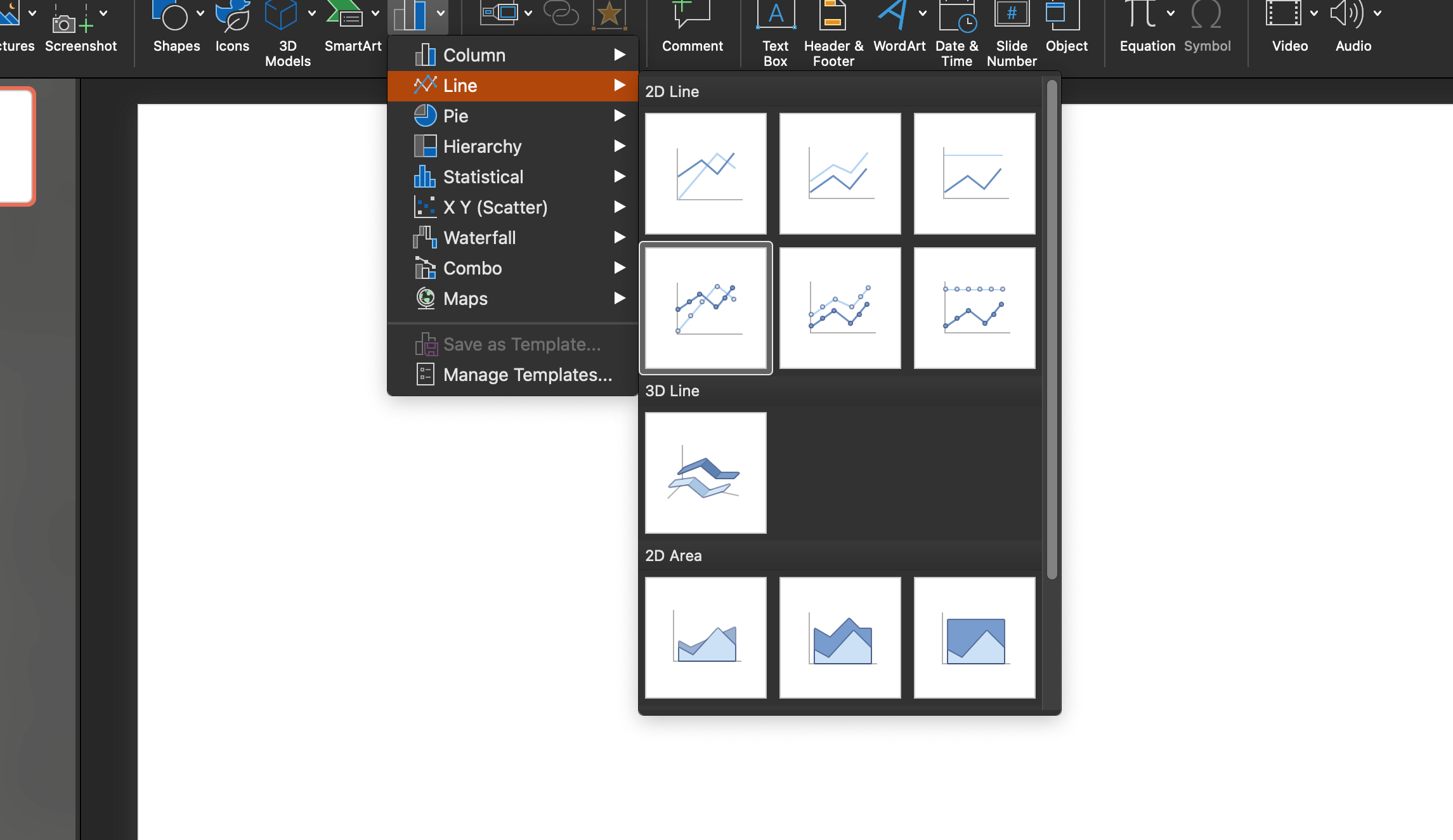
Such charts are in demand when showing trends. Key points are connected using lines, so the user can easily see trends toward increasing or decreasing values over time.
Sector (pie) charts

Pie charts are useful for comparing proportions as segments of a whole circle. Each parameter is a part of a circular pie. It is much easier for the viewer to understand what percentage of this or that value is of the whole.
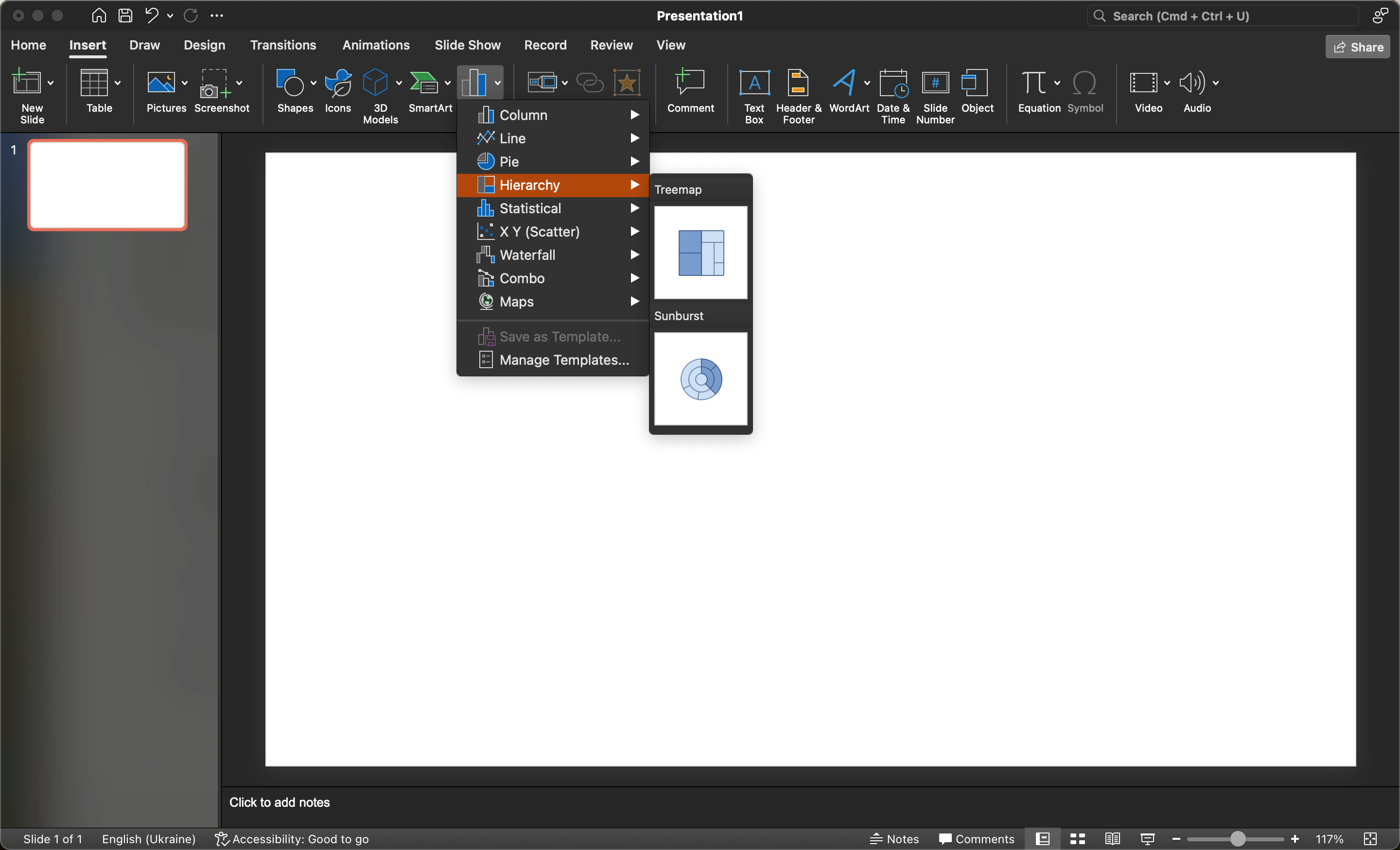
Hierarchy
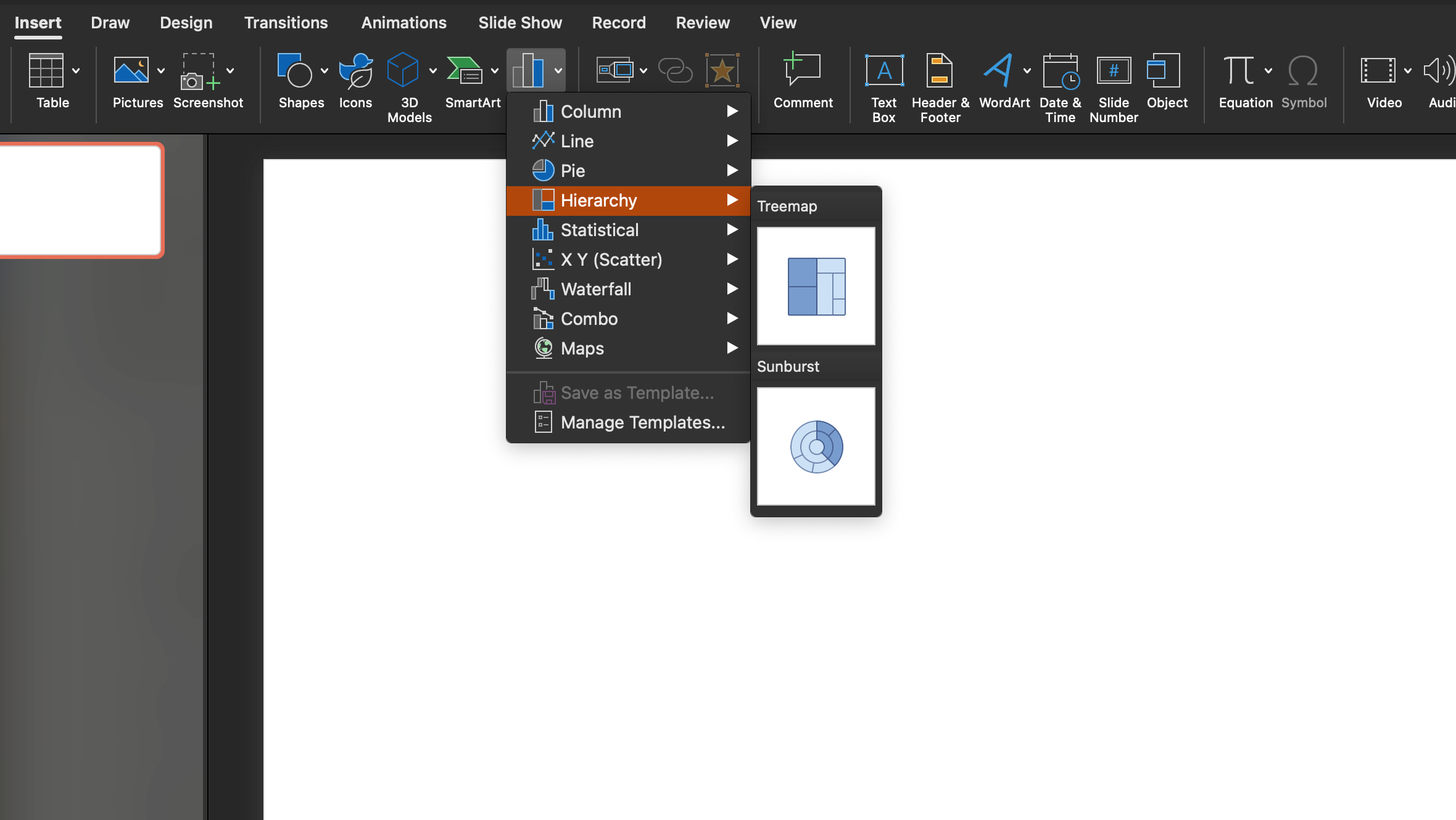
Such diagrams have similarities with linear diagrams, but the space near the lines has a color. With their help, it is convenient to view the content of each element.
Surface
With the help of surface diagrams you can form information in a three-dimensional form. Usually they are used for large data arrays and simultaneous display of different information.
How to read diagrams?
There are several basic parts to diagrams that are used to interpret published data.
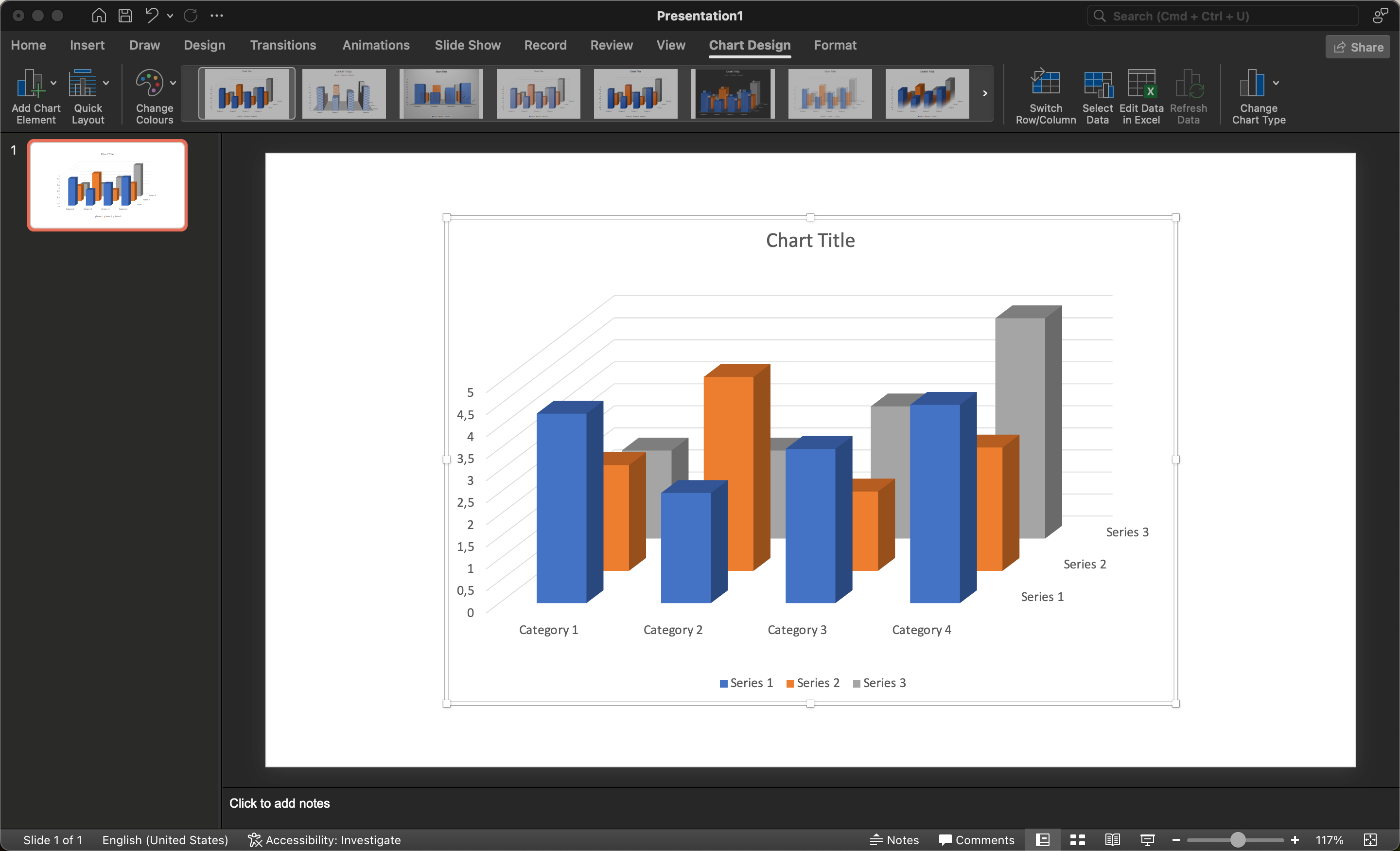
- Header. Designed to describe the essence of the chart.
2. Vertical axis (y). Used to display the values of the columns. For example, the volume of sales of goods in a particular category.
3. Horizontal axis (x). Demonstrates the categories of the chart. Here each genre appears in its own group.
4. Data series. Consists of a large amount of information published on the chart.
5. Legend. Displays what each color on the chart means. For example.
How do I add a diagram to a PowerPoint presentation?
 The main tool for forming diagrams in PowerPoint is a table. To add a Chart to a slide, you need to follow these instructions:
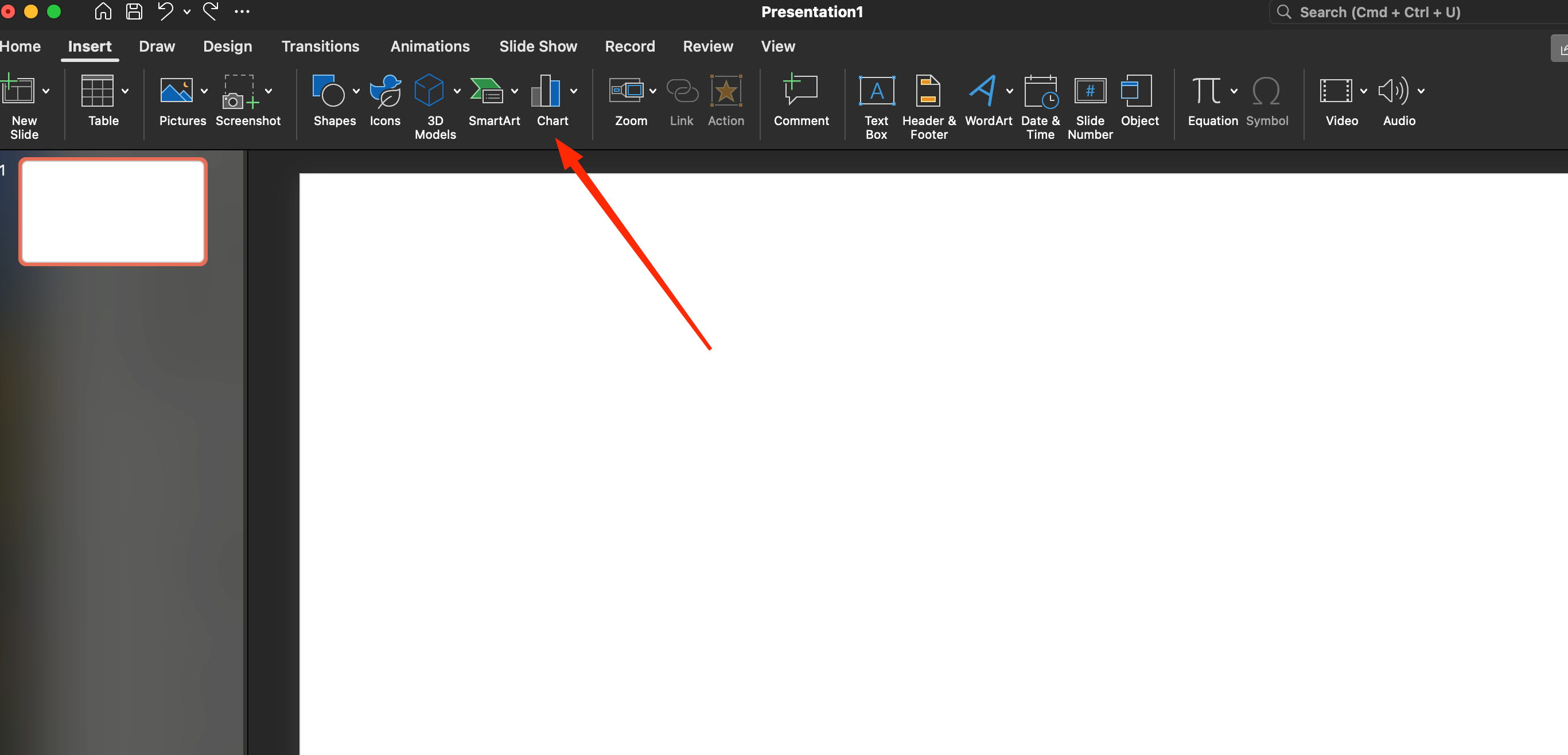
- In the “Insert” menu, select the “Chart” item.
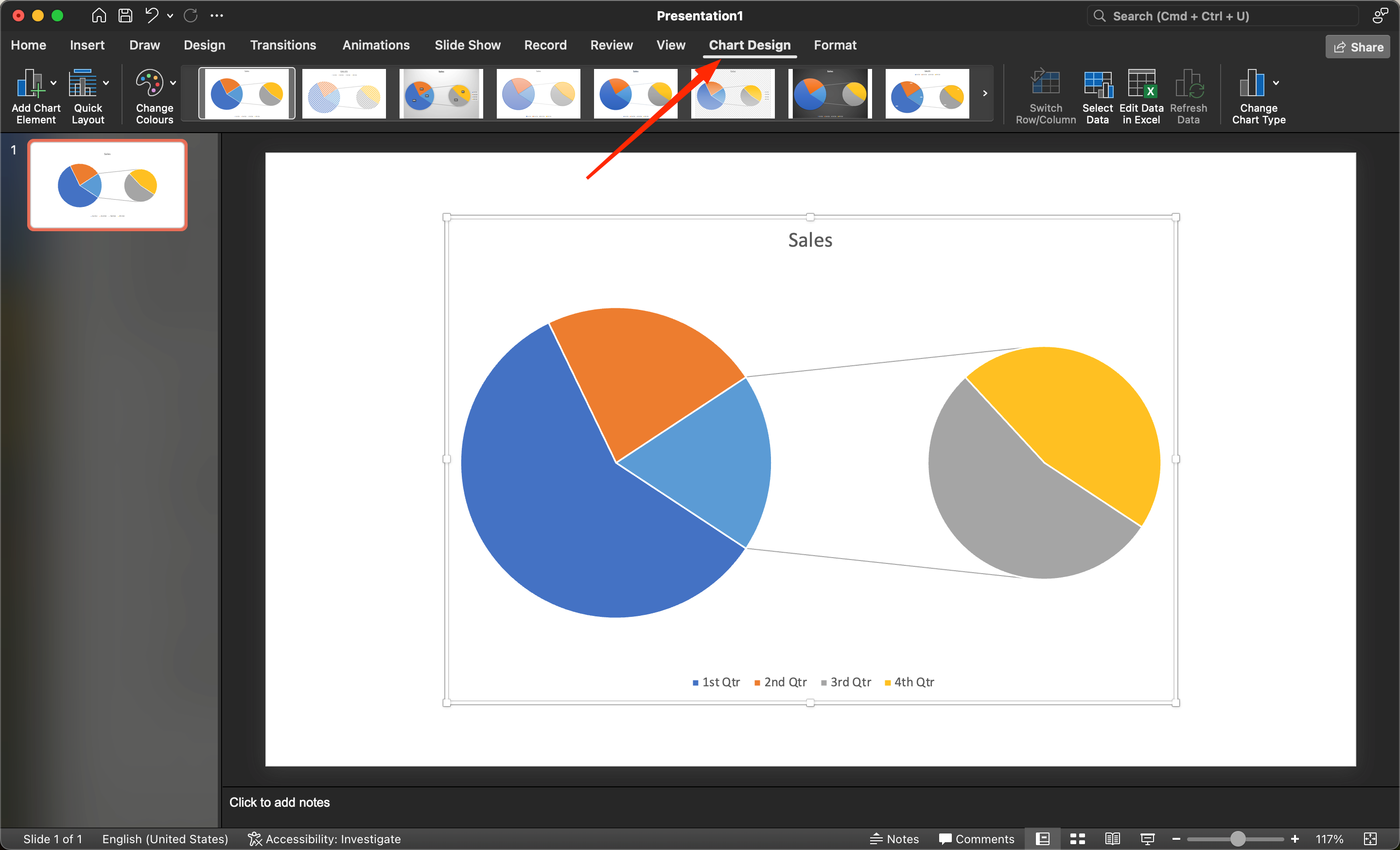
2. In the dialog box that opens, specify the type of diagram and click “Ok”.
3. This will result in a diagram and a spreadsheet. The published information in the spreadsheet will be used as input for the chart. If there are extra rows or columns present, they should be removed.
4. Next, you should specify your information, for example, the category of goods. Having prepared the necessary parameters, you should click on the cross to close the table.
Editing diagrams
To change the parameters of the diagram, you need to open the spreadsheet, following these instructions:
- Click on the chart slide to highlight it.
2. In the “Designer” menu, click on “Change data”.
A table will appear with the information where you will need to make changes.
Creating a chart based on Microsoft Office Excel settings
If you need to create a chart from an Office Excel spreadsheet, here you can proceed according to this scheme:
First method:
- Open the Office Excel application with the information to create the chart.
2. Create the chart in PowerPoint according to the instructions described above.
3. Copy the data from Excel into the PowerPoint chart.
Second Method:
The second method involves linking an Excel spreadsheet to a PowerPoint chart. The method is characterized by great convenience and simplicity, as the information in PowerPoint will change on its own if you make changes to the Excel document. The synchronization instructions are as follows:
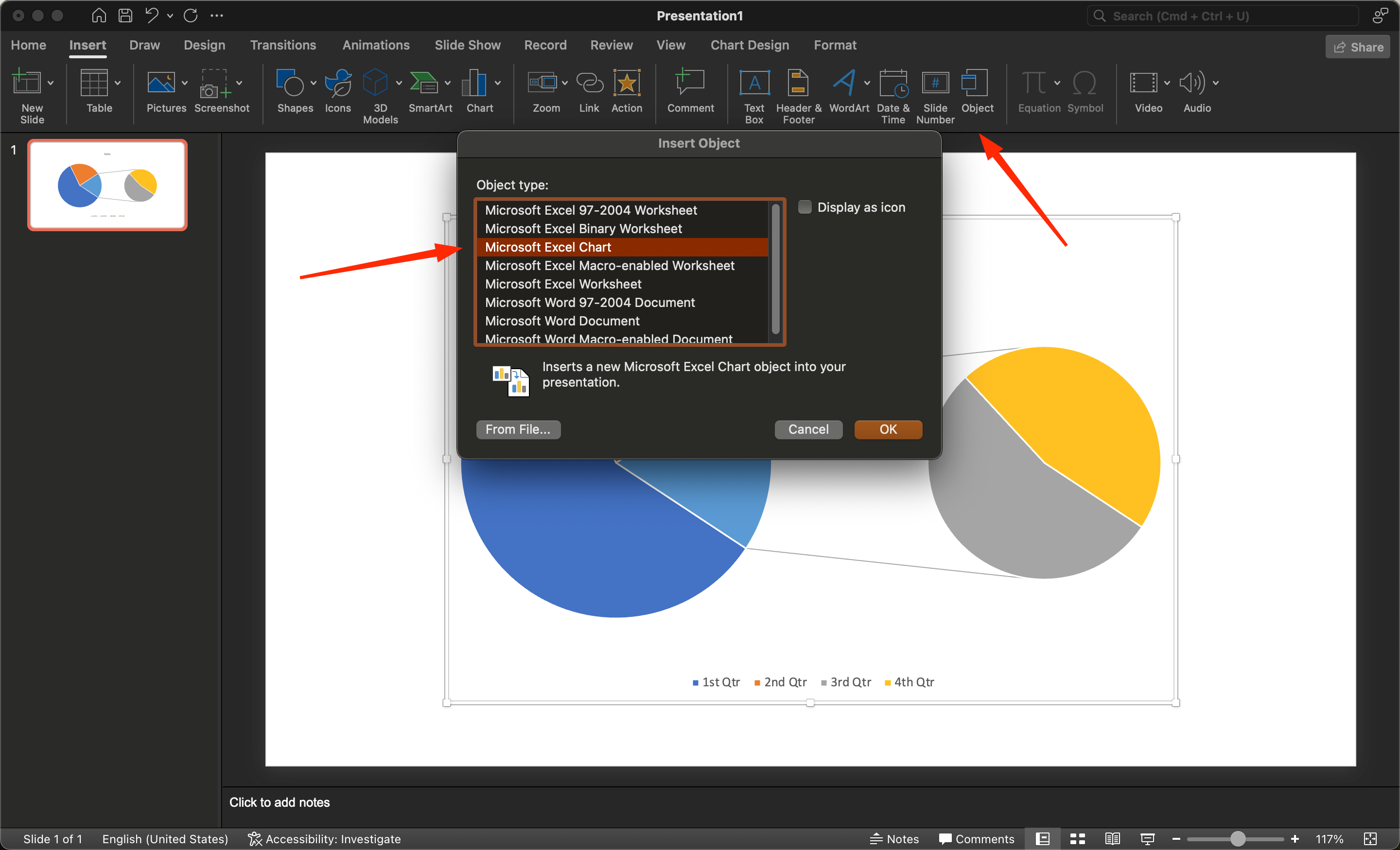
- From the Insert menu, select the Object icon.
2. In the form, click on “Create File” and use the “Browse” key to select the required document.
3. Check the box next to “Link” and click on “Ok”.
4. You will be presented with the data from the Excel file in a PowerPoint slide.
5. Next, find the “Link” option and select it with the checkbox.
6. You will be sent the data from the Excel file to the PowerPoint slide.
Another option involves directly copying the chart from Excel and then updating the data.
Within PowerPoint, a large number of tools are available to manage your charts. For example, you can change the chart type, data display format, style, etc.
If you want to change the structure of the information display, you need to left-click on the diagram to be changed. Having highlighted the diagram, you will see the “Constructor” menu and the “Change data” item. Then click on “Change data” and you will see the active keys Column and Row.


